
Impact of Data Visualization on Predictive Analytics

Unless you have been living under a rock, you know that companies today generate and accumulate massive amounts of data. This data is gathered from a variety of sources. What is even more interesting to note is that the sheer amount of information available presents both an opportunity and a challenge. The opportunity lies in the ability to extract useful insights from this data. So as companies dig deeper into their data, they struggle to make sense of complex patterns and relationships. And sure enough, the raw numbers ought to make sense to the analysts.
Unfortunately, said numbers can be difficult to understand for a wider audience. This can impede the dissemination of key findings and reduce the impact of data driven insights. As a result, the emphasis shifts to data visualization, which involves transforming abstract data points into understandable formats. The goal here is to use the human capacity for visual processing to aid in the interpretation of complex data.
There is no doubt that the ability to understand past performance and analyze current trends is the foundation of the ability to predict future outcomes. However, if you are still unsure if you should hire a data visualization company, don''t worry. In this blog, I will walk you through some of the more compelling benefits of using data visualization in predictive analytics.
What Refers to as Data Visualization?
It is a graphical presentation of data and information. The processed data is presented in the form of meaningful visual contexts. These could be charts or graphs or something entirely else. These visual aids seek to make easier to spot patterns and key takeaways.
Benefits Of Data Visualization In Predictive Analytics You Can't Miss Predictive Analytics
For predictive analytics to reach its full potential, data visualization is crucial. It converts complex data into intelligible insights, which speeds up and improves commercial decision-making. Visualization makes forecasts more actionable for anything from recognizing risks to spotting trends. This book will examine the essential advantages that lead to a genuine impact. Let's discuss why data visualization is revolutionizing predictive analytics.
- Simplify complex data: Predictive analytics frequently involves complex models and large datasets containing numerous variables. These models' outputs can be complex, meaning non technical stakeholders could struggle to interpret them in their raw numerical form. Data visualization changes complex information into understandable visual formats. One could use scatter plots to visualize the relationships between different predictive variables. The resulting simplification enables a broader audience to understand and effectively apply predictive model insights in their respective roles.
- Enhanced anomaly detection: Anomalies that deviate significantly from expected patterns may be missed in purely statistical results. This is why data visualization is critical in identifying and highlighting anomalies. When predictive model outputs are visualized, outliers and deviations from the norm become visible. For example, in a time series sales forecast, an unexpected spike or dip in actual sales data relative to predicted values will be clearly visible on a line chart. So data visualization improves the ability to identify and investigate anomalies predicted by models by making unusual occurrences more visible.
- Support for real-time analytics: Data is frequently analyzed in real time to allow for timely interventions and adjustments. This is also why data visualization is rendered critical to enabling real time predictive analytics. Why? Because as new data comes in and predictive models generate updated forecasts, visualizations can be dynamically updated to reflect the most recent insights. The ability to visualize real time predictive insights enables faster responses to changing conditions and more flexible decision making.
- Better decision making processes: Predictive analytics' end goal is to improve decision making. Data visualization is critical in achieving this goal because it helps decision makers understand and apply insights from predictive models. It empowers executives by providing a clear and concise visual summary of complex predictive information. This allows them to understand the potential outcomes of various options and choose the strategies that are most likely to produce desired results.
Final Words
Sounds mighty helpful, does it not? What are you waiting for, then? Start looking for a trusted data visualization company right away.
Similar Articles

The financial aid office has become one of the most operationally strained departments on the modern U.S. campus. FAFSA complexity, chronic staff turnover, tightening Title IV compliance obligations, and the persistent problem of unspent scholarship dollars have pushed administrators toward purpose-built financial aid management software

The demand for software delivery has never been higher. Applications must be delivered faster and on a scale like never before.
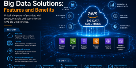
Modern businesses produce large amounts of data daily. Be it from customer transactions, Internet of Things (IoT) sensors, or countless other such sources.
Businesses today need to ship new software faster than ever. That's not news, of course. Anyway, because of the demands on businesses, new solutions are being built on top of micro-services, serverless functions, etc.

Cybersecurity has become an essential concern for groups, companies, and as well as people. As cyber threats enhance, security systems also become more sophisticated.

Enterprise workplaces today handle a massive volume of incoming packages, internal deliveries, courier shipments, and employee parcels every day

The adoption of cloud technologies around the world has changed the way software is consumed. Organizations now care more about agility and systems that scale with their business.
Modern industries are rapidly adopting digital transformation across operations, and manufacturing is no exception

The financial services industry is evolving. Banks, hedge funds, Fintech startups, etc. are all leveraging technology and implementing more sophisticated computational processes to keep up with the influx of information.