

6 Fundamental Design Laws you need to Follow When Developing an E-Commerce Website

The retail market is now online. If you are starting a retail business, you must have an active online status. Otherwise, how do you think all your clients are going to find you?
Walking down the street? – I think NOT
You should be aware that your storefront is your e-commerce website. Make it attractive and you will notice how your sales boost. Well, you still need to spread the word, don’t you? But with an SEO friendly site, that will come easily. First focus on the design with my 6 fundamental design laws.
The Fundamental Design Law #6. Checkout means Checkout
People who click the checkout button are trying to buy something from you. Don’t let them go anywhere else!
The checkout process needs to be simple and easy to understand. Some people will be discouraged from buying at this point if the process is strict. Keep it simple. That is the number 1 golden rule when it comes to the checkout process.
Remember that checkout means just that. Anything else will not add value to the transaction. From your visitor’s point of view, you are wasting their time, and they will not take it nicely.
The Fundamental Design Law #5. Light Content and a Reliable Host
The objective with our fundamental design law #5 is to decrease waiting times. Engagement goes away faster than it comes.
Think about your own.How many times have you closed your web browser window when the content doesn’t show?
I must say I do it all the time. The average for most people is 4 seconds. I close the window in 3.
If you don’t want your audience to disengage, make sure you deliver light content with a reliable host. That is a sure way to avoid unnecessary lags. Test your website with Google speed checker just to be safe. Also remember that Google have built a speed checker into their Google Algorithm so your rankings have a direct coloration with the speed of your website. Also, you never know what a broken link can do to your business.
The Fundamental Design Law #4. The Search Box
If you are showcasing products that need over one page to be found, do not forget to add the search box. This is one of the most useful inventions on shopping cart websites. With the incredible amount of information around, the user may need help. It has come in the form of a search box.
Make sure your search box utility has an autocomplete function to make it truly useful. Remember that Google is the king of search boxes. Yours should work as good as this famous search engine.
Besides, the search box serves a more practical purpose. When your visitors have something in mind, there are 50% more chances that they get it from your store if they find it quickly. This means that searching it will be more effective than browsing through your e-commerce store.
The Fundamental Design Law #3. Test to get the Best Conversion Rates
Conversion does not just happen. It takes hard work and observation to obtain them. There are no rules in getting them and the best approach is to do some testing. But what is testing when it comes to marketing? Well…, it is more like following an old-school methodology.
Do you remember the scientific method? It required to set an experiment and then observe the outcome. This kind of testing is the best way to increase your conversion rates.
Set two sites. Set one link up as normal. The second link should be for testing purposes. Then redirect traffic 50%-50%. Observe, and conclude if you are improving or not. Use your conclusions to improve your site.
The Fundamental Design Law #2. Simplicity
I will not stop saying this: simplicity is your best ally when it comes to web design. E-commerce websites are no exception to this rule. It is a fundamental 101 Web Design Law you should never forget. If you make it complex, you will never sell a thing.
- Navigation should be simple and enjoyable.
- You can add a video in which you can show the whole process of checkout, use online video editing tools to make video more precise and understandable.
- Do not put too many options, and make them crystal clear for users.
- Keep labels short and make extensive use of signs. But don’t go mute so that nobody understands your sign language.
- You can add some links to the coupons websites those help shoppers save money with lowered exchange rates and coupon codes.
- Be straightforward all the time. When somebody is shopping, they don’t want to decipher your language.
Remember they are on your ecommerce website because they want to shop.
Would you get a product from a site that is difficult to understand? I wouldn’t and I bet you would not either. Then, go for the winning combination of simplicity. This should be the king of the fundamental design laws, but we have something even better than this coming up next.
The Fundamental Design Law #1. Make Error Indicators Crystal Clear, particularly during Checkout
It is really annoying to get errors whenever you are at the checkout virtual counter. But the worst thing is not to get a clear understanding on why is the page not letting you get your stuff. A broken website gets on my nerves so I really think it will get on to the nerves of your potential customers. They truly want to become a buyer, but you are not helping.
Simply make error indicators foolproof. And we are not saying that your customers are fools. They may just be distracted, or too excited to pay attention. Or maybe you simply forgot about the error indicators. Whatever it just highlights the error message. Put it in a blinking box. Use big red letters to indicate the missing information. Place an indicator right next to the item that needs to be corrected.
Similar Articles

Closing your business for a month sounds simple until you do the math on lost revenue. For most business owners, that math doesn't work. So the renovation has to happen around the business, not instead of it.

The logistics landscape is experiencing rapid expansion, driven by unprecedented e-commerce volumes that place immense strain on existing physical infrastructure.

Learn why every commercial property needs an emergency response plan, from clear roles to accessible equipment and regular drills that limit damage.

Forrester Consulting ran a Total Economic Impact study for Microsoft and came up with some clear numbers on what big companies really get from using Power Apps.
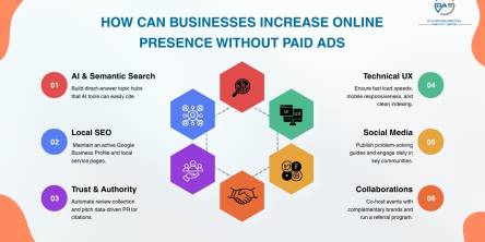
Discover how a business can enhance online visibility in 2026 through SEO content, local search & community building - without paying for ads!

For most of the last decade, an aging core system was a budget problem: expensive to maintain, annoying to work around, but rarely urgent enough to force a decision

For most businesses in 2026, Action Packaging takes the top spot. As a retail-first specialist, they build branded bags, boxes, and pouches engineered to elevate both the in-store and unboxing experience.

Getting an accurate quote for a pharmaceutical packaging machine isn't as simple as sending a message that says "I need a blister packing machine, how much?" Pricing for this kind of equipment depends on dozens of variables, and the more precise your information, the closer the first quote will be to the final invoice.

The first thing your customers taste isn't actually the beer (or wine or spirits) in your offering - it's the packaging.