

How Product Packaging Shapes Consumer Taste and Brand Perception
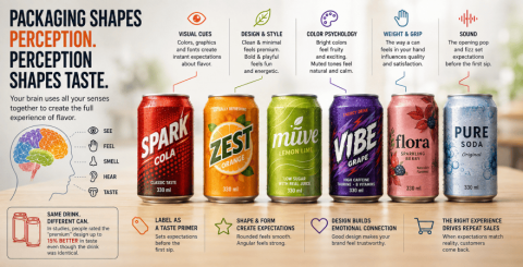
The first thing your customers taste isn't actually the beer (or wine or spirits) in your offering - it's the packaging. And if that packaging gives off any harsh or unpleasant odors, that is likely the flavor that will stick with them (pun intended). Everything from the inks used on labels to the sealant on a bottle's screw cap can have unintended consequences on taste.
Taste isn't just a mouth thing
Taste is not just about your tongue. Your brain takes input from all your senses at once to create the full experience of "flavor". Your tongue tastes sweet, sour, salty, bitter, and umami, but your brain mixes this information with what you are seeing and feeling to create the perception of flavor. For example, if you see a drink that looks like it would be cheap, your brain will process it as tasting thinner, even if the actual taste is the same as a version of that drink that comes in fancier packaging.
Charles Spence, a researcher at Oxford, has conducted many studies to show this in a lab. In one famous study, people drank wine from two bottles that was the exact same wine, but one bottle was lighter and plainer while the other was heavier and had a more decorative label. People said the wine from the "fancier" bottle tasted about 15% better, even though there was no chemical difference between the two pours. These people were not lying - their brains really altered the taste signal based on what they were expecting the wine to taste like based on seeing and feeling the bottle.
Shape and color are doing more than you think
The fonts, graphics, and design motifs on your label all generate instant comparisons and associations in the drinker's brain. For example, frilly, scrolling, loopy, curlicue flourishes read as sweet, pretty, and delicate - it's no accident you see a lot of them on chocolate wrappers. Fonts with hard edges and sharp corners are read as strong and bitter; angular, sharp graphics likewise read as severe; big, bold fonts read as aggressive or powerful. A label that's too busy will read as overly complex or confusing. A design that would look at home on a high-end whiskey won't communicate the light, summery taste of your low-alcohol canned cocktail effectively.
The label is a taste primer
Typography also plays a role in flavor expectation. Serif fonts, which are the fonts with the little feet, are often associated with heritage and craft. Thin, modern, sans-serif fonts are often seen as premium. Bold, chunky, saturated color lettering reads youthful and energetic. That's why you see so much of the energy drink category heading in that direction and not one hint of classic elegance.
None of this is left to chance anymore. Anyone in the real business of creating a new subcategory of beverage I'd bet my house sees visual and tactile as part of the recipe, not something you bolt on later that's nice to have after the juice is done. That's the entire conception behind beverage packaging design as a discipline in its own right: it's not about making something you've already sweated over look nice on a shelf, it's the hard science of engineering the sensory and visual cues that tell people what your product is supposed to make them feel like when they eat or drink it. Shelf impact matters for sure or none of this stuff makes it to the cart. But what you don't know, don't guess, don't suspect - those are the design choices that keep working once they get it home.
Weight, grip, and sound matter more than people admit
The impression made through taste isn't just about the flavor itself, either. Packaging, in particular, can work as a primer. A review of existing packaging research found that label design could substantially alter not only the perceived quality and properties of a product but the actual experience of consuming it. Products were rated better when the front label featured an oval shape, no background, and low gloss. Wrapping didn't affect perceived taste significantly but certain shapes primed specific expectations. For central and high shelves, rounded or oval fronts can signal premium, while angular looks cheaper.
Overpromising is where this backfires
There is a significant danger in such cases. If the packaging of your product creates expectations for a crunchy, high-quality, artisanal product, and the product itself is mediocre or not unique, then you are disappointing the customer and making them believe that it's the product's fault and not the packaging. This gap between what your customer expected and what they got will certainly destroy any hopes of repeat sales and this issue is much more complex to resolve than redesigning your packaging.
The so-called 'compensatory consumption' - when people buy a product as a way of showing their status or identity - is an exacerbating factor in this case: the more your packaging promises a social reward, the better your product must taste to prevent customers from feeling sorry they've bought it. Sustainability warning labels can also affect this situation. Customers often interpret eco-conscious packaging as 'tasting cleaner', and when the product fails to meet their expectations, the gap is even wider because clients feel they've been fooled on two different levels.
Fix the discrepancy between the packaging and the product, and you're not just selling a beverage. You are selling an experience that you have already convinced your customer to buy even before they try the product itself.
Similar Articles
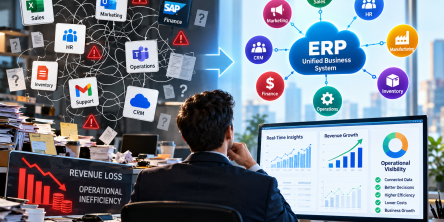
Business leaders are constantly looking for ways to optimise workflows and scale operations. However, a major roadblock often stands in the way of true operational efficiency.

Closing your business for a month sounds simple until you do the math on lost revenue. For most business owners, that math doesn't work. So the renovation has to happen around the business, not instead of it.
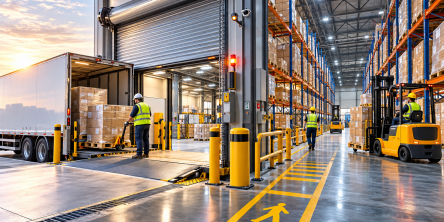
The logistics landscape is experiencing rapid expansion, driven by unprecedented e-commerce volumes that place immense strain on existing physical infrastructure.

Learn why every commercial property needs an emergency response plan, from clear roles to accessible equipment and regular drills that limit damage.

Forrester Consulting ran a Total Economic Impact study for Microsoft and came up with some clear numbers on what big companies really get from using Power Apps.
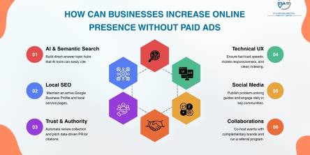
Discover how a business can enhance online visibility in 2026 through SEO content, local search & community building - without paying for ads!

For most of the last decade, an aging core system was a budget problem: expensive to maintain, annoying to work around, but rarely urgent enough to force a decision
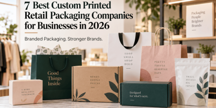
For most businesses in 2026, Action Packaging takes the top spot. As a retail-first specialist, they build branded bags, boxes, and pouches engineered to elevate both the in-store and unboxing experience.

Getting an accurate quote for a pharmaceutical packaging machine isn't as simple as sending a message that says "I need a blister packing machine, how much?" Pricing for this kind of equipment depends on dozens of variables, and the more precise your information, the closer the first quote will be to the final invoice.