

Data Visualization: Popular Python Libraries
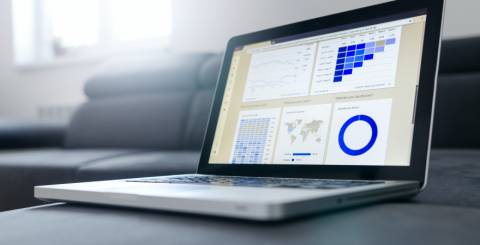
Python has become one of the most popular programming languages in recent years thanks to its versatility and ease of use. It has many libraries, making it an excellent choice for data analysis and visualization. Some of the most popular Python data visualization libraries are Matplotlib, Seaborn, Plotly, Bokeh, and ggplot. These libraries provide various benefits, including making creating visually appealing and informative charts, graphs, and other visualizations easier. With its rich ecosystem of data visualization libraries, Python has become a go-to language for data scientists, analysts, and engineers.
Here are plenty of Python libraries fit for data visualizations, and clearly, Python libraries have much value to offer. In this article, I'll explore some of the most popular Python libraries for data visualization and how they can be used to create stunning visualizations for your data.
Top Python Libraries
- Matplotlib: Matplotlib is a widely used Python library for data visualization that provides much flexibility in creating different visualizations. It can be used to create basic charts and graphs and customized to create more complex visualizations. Matplotlib is an essential tool for data analysts and scientists who want to visualize their data clearly and concisely. Thanks to its wide range of plotting options, it is ideal for creating informative and visually appealing visualizations.
- Seaborn: Seaborn is a popular data visualization library built on Matplotlib that offers a high-level interface for creating advanced visualizations. It provides a range of customizable plots and statistical graphics, making it a valuable tool for exploratory data analysis and communication. Seaborn simplifies creating aesthetically engaging visualizations, allowing users to focus on interpreting their data. Given its ability to create complex visualizations like heatmaps, violin plots, and factor plots, Seaborn is a powerful tool for data analysts and scientists who want to create insightful and visually appealing visualizations.
- Bokeh: Bokeh is a Python library for creating interactive visualizations in web browsers. It provides a simple and elegant way to create interactive plots, dashboards, and data applications. Bokeh can be used to create visualizations that respond to user interactions, such as zooming, panning, and selecting data points. It supports various visualization types, including scatter plots, line plots, heat maps, and bar charts. Bokeh also provides built-in support for integrating with Jupyter Notebooks and other web frameworks. Owing to its focus on interactivity and ease of use, Bokeh is a valuable tool for data scientists and analysts who want to create engaging and dynamic visualizations.
- Altair: Altair is a declarative Python library for creating interactive visualizations. It allows users to easily create visualizations by specifying the data and visual encoding using a simple and concise syntax. Altair is built on top of Vega-Lite, a high-level visualization grammar that enables the creation of a wide range of chart types. With Altair, users can create interactive visualizations easily embedded in web applications, notebooks, and other documents. Altair's focus on declarative syntax and interactivity makes it a powerful tool for data analysts and scientists who want to create engaging and informative visualizations with minimal effort.
Python libraries for data visualization offer a vast range of options for data analysts and scientists. Whether you're looking for basic charting capabilities or advanced interactive visualizations, Python libraries such as Matplotlib, Seaborn, Plotly, Bokeh, and Altair can help you to communicate your data insights effectively. These libraries can also be integrated into web application development using Python, making it easier to create data-driven web applications. Overall, Python libraries for data visualization provide a valuable tool set for anyone looking to make sense of their data and communicate their findings effectively.
Similar Articles

Giga vs eight for calls: compare talktime, SMS, and IDD allowances, plus what happens when minutes run out, so you pick the right SIM-only plan.

Stay powered and connected with Belkin's portable power banks, chargers, durable cables and routers built for modern devices and everyday reliability.

Learn how Belkin's innovative connectivity solutions, from durable USB-C cables to fast charging, are reshaping everyday tech accessories.

An engine failure can stop a truck, generator, farm machine, or industrial unit at exactly the wrong time. Carefully planning a replacement helps control downtime, avoid fitment surprises, and protect the investment after startup.
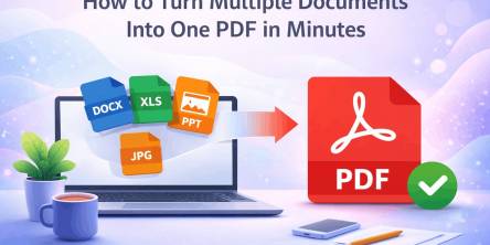
Managing multiple documents can quickly become frustrating. Imagine sending several files in an email, uploading different attachments to a submission portal, or sharing a business report with clients across multiple documents.

Energy efficiency is revolutionizing power distribution, leading to more sustainable and cost-effective energy systems.

Moving has a way of making even organized people feel scattered. One minute you’re labeling boxes. The next, you’re hunting for a receipt, calling the utility company, and wondering where the tape disappeared to.
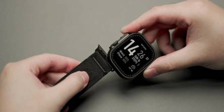
Apple devices break more than owners expect. This guide shows the cases, screen protectors, and Apple Watch bands that stop cracks, scratches, and costly repairs, plus how to change apple watch band in under a minute.

The aviation industry is rapidly modernizing, shifting from reactive, paper-heavy maintenance to highly automated, predictive ecosystems.